Mediation
Design a low-code data transformation solution that links raw usage data to billing systems, from 0 to 1

Background
More and more businesses are adopting consumption-based billing models, but raw usage data cannot be directly used for billing. For example, mobile operators record users’ call durations, the number of text messages sent, and data usage. However, this data is often scattered and unprocessed. Businesses need to first clean and aggregate the data before manually uploading it to the billing system. This process is tedious, error-prone, and affects billing efficiency and accuracy.
My Role
Solo designer crafting the end-to-end user experience
Timeline
July 2023 - April 2024
Result
10 Adoptions
(As of March 2025)
Team
1 Product Manager
1 Engineering Lead
2 FE Devs, 7 BE Devs
Hello, I'm Xinhui, a UX designer.
👋
For the past 5 years, I’ve worked on consumer-facing mobile design at ByteDance and enterprise-facing web design at Zuora. Throughout my journey, I’ve been driven by a passion for bridging the gap and transforming complex systems into intuitive, user-centered experiences.
Please check out my portfolio on a desktop 🖥️
TL;DR
Phase 1
Rapidly outline core flow for leadership buy-in
3 days
I had 3 days to create mockups of the key user journey, quickly understanding the background, goals, and user needs, while aligning with the team. Although I was asked to reuse patterns from Workflow, I adapted the experience to meet Mediation's unique needs.
Phase 2
Expand feature set
5 months
In the early stages of developing new features, I worked closely with backend developers to understand the underlying logic and technical terminology, then translated this information into an intuitive user experience.
Phase 3
Revise and polish
2 months
I revised the design based on feedback from the solution architect team and refreshed Mediation's visual design to make it more distinctive and modern.
General Availability (GA) 🎉
Feb 2024
Strategic Goal
With Mediation, Zuora advances its strategic vision, delivering a complete consumption-based billing solution.
Mediation is the strategic enabler that bridges the gap between raw usage events and billable records. It ensures data accuracy, supports real-time processing, and provides the flexibility needed to successfully implement and scale consumption-based pricing models—core to Zuora’s value proposition in today’s dynamic subscription economy.
Usage Data
Mediation
Billing
Revenue
Problem
Harnessing and monetizing usage data is challenging, because:
Data is scattered across multiple sources
Requires hard-coded logic to align with business needs
Manually processed data lacks fidelity and traceability
Highlight 1
Effortlessly consolidate scattered data and build data transformation pipelines with low-code interface

Highlight 2
Robust traceability—trust the data you use

As of March 2025
Customers in production:
10

Zuora customers are processing upwards of 6.2 billion usage events per month through Mediation.
The making of Mediation
The long story behind the solution:
the challenges, the mistakes, and the lessons learned.
Not all projects start exciting—
some begin with "Just copy, please.”
I was brought onto the team and handed serval concept mockups that were basically clones of Workflow—a feature I had already worked on. The expectation? Just reuse everything and transform these screens into a complete user flow to gain leadership buy-in.

Screenshot of Workflow (live feature)

Concept Mockup of Mediation
Phase One
Outline core experience
Challenge 1
Rapidly onboard and map out the key user journey within 3 days
I was tasked with creating mockups of the key user journey by the end of the week—immediately after attending the kick-off meeting. I had to quickly grasp the background and business goals, learn about target users and their tasks, research competitors, map out the flow, create mockups and review it with the team for alignment, all in just 3 days.
Understand the problem
I communicated with the product manager and conduct desk research to understand the problem the product is trying to solve.
4W1H
Who
IT teams
What
Hard to convert raw usage data into reliable billable items
when
With the rising popularity of consumption-based pricing models, the IT team needs to upload usage data to the billing system at regular intervals.
Why
Data is scattered across multiple sources
Requires hard-coded logic to align with business needs
Manually processed data lacks fidelity and traceability
How
Design a solution that:
Automates raw data collection from multiple sources
Applies configurable transformations instead of hard-coded logic
Ensures data fidelity with traceable pipelines
What competitors do we face,
and where do they excel or fall short?
The market is a niche, with DigitalRoute as our direct competitors. I looked into their reviews to identify what they do well and where they fall short.
Pros
Reliable system
Good customer support
Cons
Hard to add function that is not present
Quite daunting tool for non-technical users
Difficult for beginners to understand and customize
The reviews indicate that DigitalRoute is used by both technical and non-technical users. This prompts the question: who exactly is our target audience?
After speaking with my PM, our hypothesis is that this tool will be used by multiple personas, including both technical and non-technical users. The IT team will be responsible for setting up data input and output, while Billing Ops will focus on building the pipeline to transform the data in order to meet business needs.
Takeaways
Multiple audiences: both technical and non-technical users
The design should be friendly for non-technical users while offering advanced options for professionals when needed.
Opportunity: focus on optimizing the experience for new users.
This weakness in our competitors is also an opportunity for us.
How might we design a solution that automates custom data transformation from multiple sources with traceability?

Wireframing within the constraints of an established UI framework and patterns
Challenge 2
Bridge familiar patterns with the new context and requirements
I was required to reuse the UX patterns and assets from another product to reduce development costs and risks (as it is a proven design).
I avoided blindly copying what had worked before. Instead, I identified differences between the two features, ensuring the user experience was thoughtfully tailored to the unique needs of Mediation.
Identify the subtle differences to craft a purpose-driven solution
On the surface, Mediation and Workflow both appear to be automation products. But what sets them apart from a UX perspective, and how might they require different design choices?
Difference
Design Implication
User and Their Technical knowledge
Workflow users are IT architects;
Mediation involves both Billing Ops, who understand the business side of the meter-building process but may lack technical expertise, and IT architects.
The design should be friendly for non-technical users while offering advanced options for professionals when needed.
For basic configurations, the design should use plain language and avoid technical jargon.
Flexibility in Process Building
Workflow automates streamlining multi-step processes, often integrating with enterprise systems;
Mediation automates usage data processing, often connecting data sources and billing systems.
The design should guide users to define a source and a target (billing system) as the starting and ending points.
Trigger
Workflow can be initiated through user actions, scheduled times, or billing events.
Mediation processes are data-driven, activated upon the ingestion of usage data.
The design should allow users to view the meter's operating status and provide corresponding actions for managing the meter.
The design should support refreshing to obtain up-to-date data in the audit trail.
Run Result
Workflow is task-driven with a low volume of discrete tasks, typically returning success or error via API responses;
Mediation is data-driven with a high volume of events(up to 200k per second). Each operator within the meter manages its input and output data, while individual events may contain dozens of fields.
The design should present the overview first and allow users to click for more detailed views.
Tailor for Mediation
Highlight 1
Meter Stream (Edit): Use placeholder cards for data input and output to simplify learning and reduce user errors.
The mediation pipeline must start with a source component and end with a target component. To reinforce this requirement and prevent errors, I designed the empty state with predefined placeholders, providing visual guidance to help users understand how to add sources and targets.

Meter Stream (Edit)
Highlight 2
Audit Trail (View): Easy tracing with a split view. Bring essential information upfront while enabling deeper exploration in the drawer.
In the Audit Trail, I adopted a split layout where users can click on a component in the left pipeline to view input and output data on the right drawer.
However, due to the high volume of data (up to 200k per second) and quite a few fields per event (typically 10-20 fields), it is not possible to display all the data within the limited space.
Therefore, my strategy is to first display key information and then allow users to investigate further according to their goal. The key points are:
For validation, offer an expand-to-full-screen feature so users can view fields in a larger space
For debugging, provide a "Show Errors Only" toggle to help users quickly find problematic events
In addition, I changed the flow orientation to vertical. This change was based on feedback from workflow users, as the horizontal flow is difficult to display in portrait mode, making it inconvenient for users to view the entire flow.

Audit Trail (View)
Highlight 3
Design Principle:
Simplifying for non-tech users, empowering tech users
Hide advanced configurations to reduce cognitive load for non-technical users while providing a code input option for technical users to fulfill needs beyond pre-built features.

Component Configurations

Mockups of Core User Experience
Looking back, what did I miss in the rush?
One important piece of feedback we received from leadership is that we need a simpler way to accommodate straightforward use cases, such as calculating MAX, MIN, or Count.
This made me realize that my design process lacked an understanding of use cases—our solution was overkill for such simple use cases.
To address this, we introduced "Standard Meter" in later iterations, which features a predefined meter, allowing users to easily set up a meter through simple field mapping.
The transformation pipeline that can be freely designed is referred to as "Custom Meter". Through further engagement with potential users, we discovered that most of their use cases required "Custom Meter".
Lesson Learned
Be aware of what you don’t know and always question further
Ultimately, everything boils down to understanding and addressing the real issues people face. I learned from this experience that always questioning your assumptions and being aware of what you don’t know is crucial, as overlooking key details or gaps in knowledge can lead to design decisions that miss the mark.
Phase TWO
Develop and expand component set
Entering the second phase, I finalized the design and the frontend team started development. Meanwhile, I started collaborating with the backend team on designing more components.
Challenge
Decode backend logic and translate it into an intuitive experience
In the early stages of developing the new feature, I worked closely with backend developers to understand the mechanics and effectively translated them in a way that was clear and accessible to users.
Case Study
Lookup Feature: finding harmony between technical constraints and user experience
User need
Users need fields from Zuora Billing for subsequent transformation.
Technical constraint & solution
Querying data is time-consuming (taking up to hours) and heavily impacts performance. To address this, the backend team developed a prefetch & lookup function that loads frequently used data into a separate table and creates a quick lookup index, reducing the need for multiple database queries and accelerating the process.
Impact on user experience
Introduced additional configurations
Required waiting time for data prefetch
1
/ 6
Tackle the problem starting with
understanding how the backend works

2
/ 6
How might we create an intuitive experience while concealing unnecessary technical complexity?

3
/ 6
Ideate the flow

4
/ 6
More streamlined?

5
/ 6
Can we eliminate manual actions and minimize the perceived waiting time?

6
/ 6
Discuss solutions with my team

1
/ 6
Tackle the problem starting with
understanding how the backend works
2
/ 6
How might we create an intuitive experience while concealing unnecessary technical complexity?
3
/ 6
Ideate the flow
4
/ 6
More streamlined?
5
/ 6
Can we eliminate manual actions and minimize the perceived waiting time?
6
/ 6
Discuss solutions with my team
Solution
Hybrid Approach:
Auto Prefetch on Running Meter + Manual Prefetch
We chose the hybrid approach, combining Auto Prefetch on Running Meter with Manual Prefetch. This allows users to benefit from automatic prefetching while also having the option to manually refresh or prefetch data when needed, providing full control.
For new users, enriching events with Zuora standard fields is straightforward, with just a simple notification about longer initialization time, and no unnecessary fetches performed in the backend. Experienced users, on the other hand, can prefetch data in advance, reducing waiting time.

Mockups of Enhanced Enrichment Component
Phase THREE
Revise and polish
Revise design based on internal feedback
Around December, the core functionality development was complete, and we started engaging with more prospective customers, which required customized demos based on their use cases. To prepare these demos, we collaborated with the solution architect team, who provided valuable feedback on user experience during the enablement sessions. At this stage, I was revising the design based on their input.
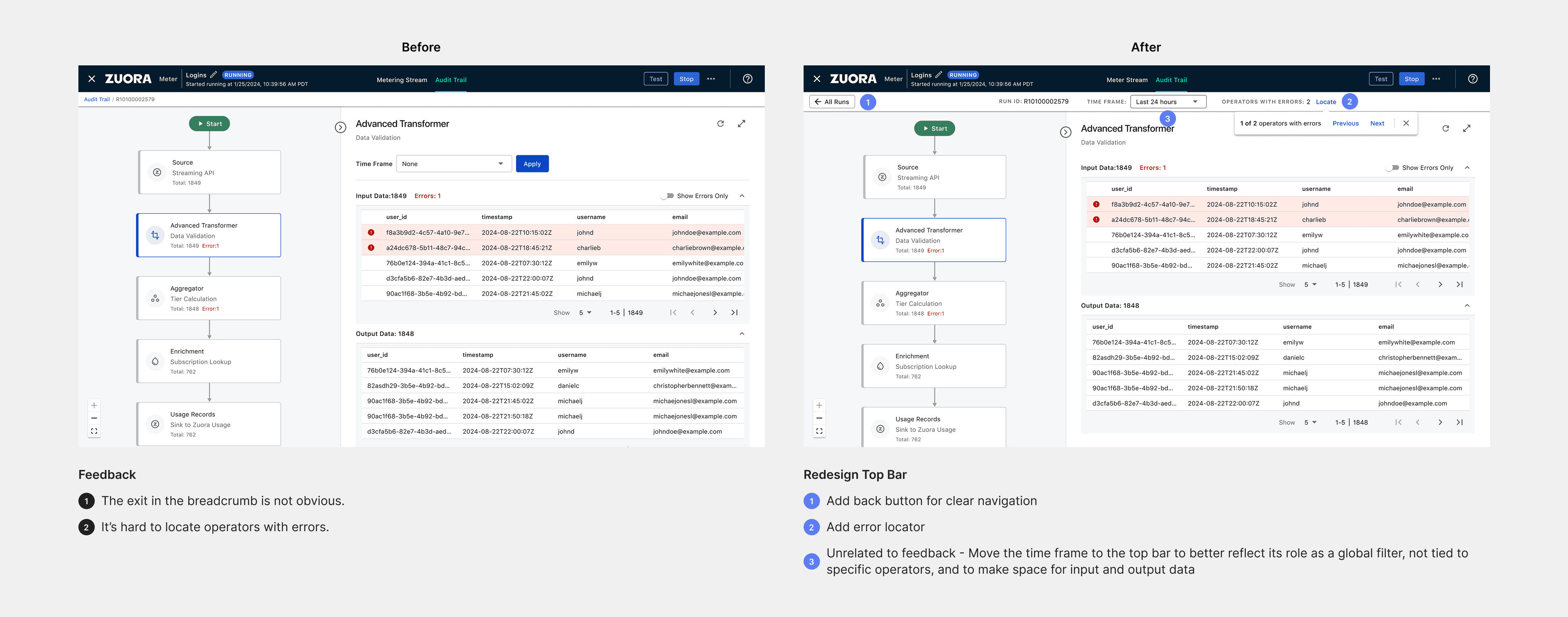
Example of Feedback-informed Revision
Revamp visual design
When we introduced Mediation to our existing customers, they felt that it was just another Workflow due to the similar look. To change this perception, we refreshed Mediation’s visual design, making it both more distinctive and modern, as the Workflow’s design had remained unchanged for years.


Final Design

Reflection
What would I do differently?
This project has always been fast-paced, and I've had to design in the face of uncertainty, with many design decisions made based on assumptions, without the opportunity to validate them.
In an agile environment, there’s rarely a clear "done" moment to test. This makes it essential to continuously seek validation opportunities throughout the project. If I were to approach this project again, here’s what I would do differently:
Document Design Decisions: I would thoroughly document my design decisions and assumptions, providing clear reasoning for my choices, so they could be validated later if possible.
Proactively Engage with Internal Users: I would reach out more proactively to solution architects to better understand how they use the feature and validate design choices I’m unsure about.