OneID
Enhancing user provisioning experience of OneID - an Identity and Access Management (IAM) platform

Background
Zuora OneID is an Identity and Access Management (IAM) platform that unifies access to all Zuora products with a single authentication system, replacing fragmented login systems. It also centralizes user permission management, enhancing both security and administrative efficiency.
As nearly all Zuora users have onboarded to OneID by November 2024, and all new customers will rely on it, it’s crucial to ensure a seamless user experience.
My Role
Solo designer conducting research and designing solutions
Timeline
Two weeks in November 2024
Result
Identified 80 issues / potentials
Resolved 22 key issues
Team
1 Product Manager
1 Frontend Engineer
Hello, I'm Xinhui, a UX designer.
👋
For the past 5 years, I’ve worked on consumer-facing mobile design at ByteDance and enterprise-facing web design at Zuora. Throughout my journey, I’ve been driven by a passion for bridging the gap and transforming complex systems into intuitive, user-centered experiences.
Please check out my portfolio on a desktop 🖥️
The Problem
User Query Tickets
339
24% of Total Tickets
After launching OneID and announcing plans to deprecate old login systems, we received 1,402 support tickets between June and October. Of these, 339 were user questions, suggesting that the user experience of OneID may be problematic. We need to investigate pain points to reduce user frustration.
What questions are people raising?

After reviewing all support tickets categorized as user queries, I found that recurring questions center around:
1
Requests for guidance on how to get started
2
Problems encountered while managing user access
Understanding user task
Before diving into UX issues, I work with the PM to gain a clear understanding of the platform's features and the tasks users need to perform. It helps shape the research study design.
Since all existing customers have already migrated to OneID, the focus of this experience optimization is on new customers. We need to design a seamless provisioning management experience for them.
User
Admin of new customer
Goal
Manage user provisioning
Task

Identify issues behind the questions
With the user tasks in mind, I conducted a UX review of the existing experience to uncover usability issues and opportunities, and also invited four colleges to perform cognitive walkthroughs to identify learnability issues.

Cognitive Walkthrough Results
Then I compiled my UX review findings and cognitive walkthrough results into a list of over 80 optimization items, ranging from minor UI issues to major user experience blockers. After sharing it with the PM for review, we discussed and identified 22 key items (high- or medium-priority) that need immediate attention.

List of Priority Issues
Main Problem One
Users are unclear about provisioning modes and procedures.

Issue 1
Low discoverability of provisioning modes
Global provisioning mode is a foundational setting that should be set upfront and typically remains unchanged.
However, it is hidden in the top-right corner under "Settings," making it difficult to discover and preventing users from quickly grasping the available methods for user provisioning.
Additionally, with the default set to "mixed," users are forced to select the mode each time they manage provisioning. Furthermore, for users who don't use group provisioning, the "User Groups" tab on the left becomes irrelevant.
Global provisioning mode is a foundational setting that should be set upfront and typically remains unchanged.
However, it is hidden in the top-right corner under "Settings," making it difficult to discover and preventing users from quickly grasping the available methods for user provisioning.
Global provisioning mode is a foundational setting that should be set upfront and typically remains unchanged.
However, it is hidden in the top-right corner under "Settings," making it difficult to discover and preventing users from quickly grasping the available methods for user provisioning.
Issue 2
Unclear provisioning procedures
Since all the modules are displayed flatly in the left navigation, users are unsure of the correct order of actions.
For example, users must first create user roles, then create user groups, and only afterward can they assign user groups to specific users.

Home Page
Issue 1
Low discoverability of provisioning modes
Global provisioning mode is a foundational setting that should be set upfront and typically remains unchanged. However, it is hidden in the top-right corner under "Settings," making it difficult to discover and preventing users from quickly grasping the available methods for user provisioning.
Issue 2
Unclear provisioning procedures
Since all the modules are displayed flatly in the left navigation, users are unsure of the correct order of actions. For example, users must first create user roles, then create user groups, and only afterward can they assign user groups to specific users.
Solution
Streamline onboarding experience
with in-app guide
The solution is to provide an in-app guide that bring global provisioning mode setting to the forefront and provide step-by-step guidance based on the chosen provisioning mode.
The design follows the pattern established in other Zuora products.

In-app Guide
Main Problem Two
Confusing user provisioning experience
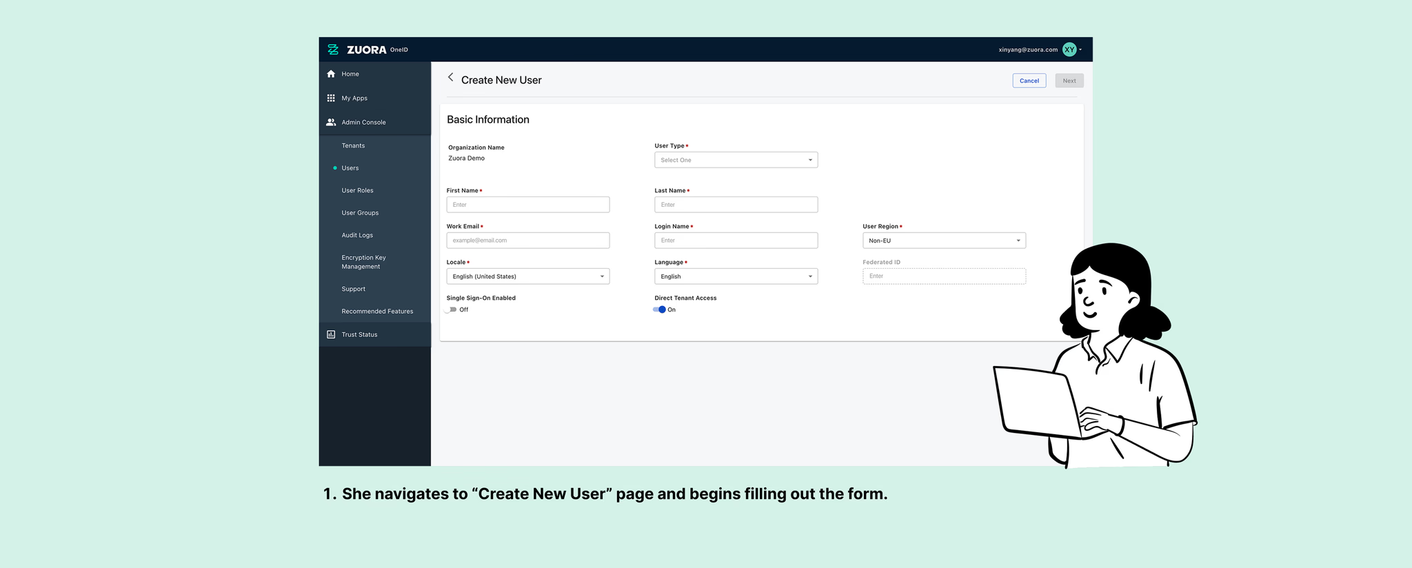
User Story
Isabella is an IT Admin.
Her company recently adopted Zuora products, and she needs to create user accounts and manage access in OneID.
1
/ 7
2
/ 7

3
/ 7
4
/ 7
5
/ 7
6
/ 7

7
/ 7
User Story
Isabella is an IT Admin.
Her company recently adopted Zuora products, and she needs to create user accounts and manage access in OneID.
1
/ 7
2
/ 7
3
/ 7
4
/ 7
5
/ 7
6
/ 7
7
/ 7
User Story
Isabella is an IT Admin.
Her company recently adopted Zuora products, and she needs to create user accounts and manage access in OneID.
1
/ 7
2
/ 7
3
/ 7
4
/ 7
5
/ 7
6
/ 7
7
/ 7
User Story
Isabella is an IT Admin.
Her company recently adopted Zuora products, and she needs to create user accounts and manage access in OneID.
1
/ 7
2
/ 7
3
/ 7
4
/ 7
5
/ 7
6
/ 7
7
/ 7
User Story
Isabella is an IT Admin.
Her company recently adopted Zuora products, and she needs to create user accounts and manage access in OneID.
1
/ 7
2
/ 7
3
/ 7
4
/ 7
5
/ 7
6
/ 7
7
/ 7
User Story
Isabella is an IT Admin.
Her company recently adopted Zuora products, and she needs to create user accounts and manage access in OneID.
1
/ 7
2
/ 7
3
/ 7
4
/ 7
5
/ 7
6
/ 7
7
/ 7
User Story
Isabella is an IT Admin.
Her company recently adopted Zuora products, and she needs to create user accounts and manage access in OneID.
1
/ 7
2
/ 7
3
/ 7
4
/ 7
5
/ 7
6
/ 7
7
/ 7
User Story
Isabella is an IT Admin.
Her company recently adopted Zuora products, and she needs to create user accounts and manage access in OneID.
1
/ 7
2
/ 7
3
/ 7
4
/ 7
5
/ 7
6
/ 7
7
/ 7

Issue 1
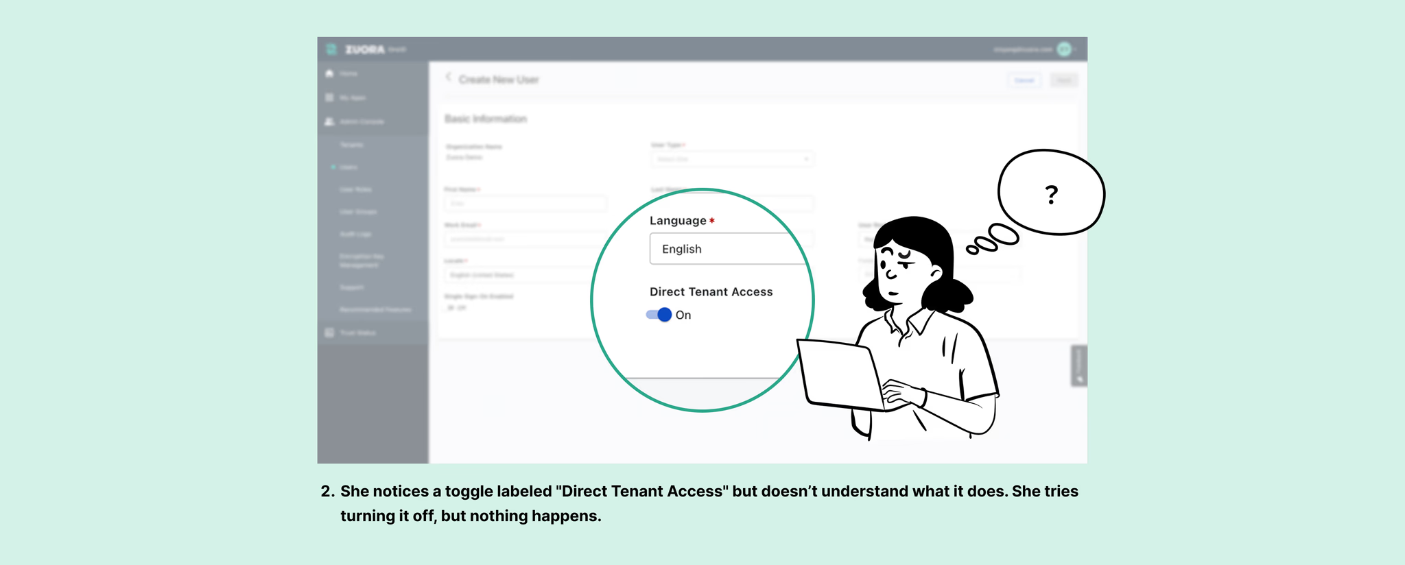
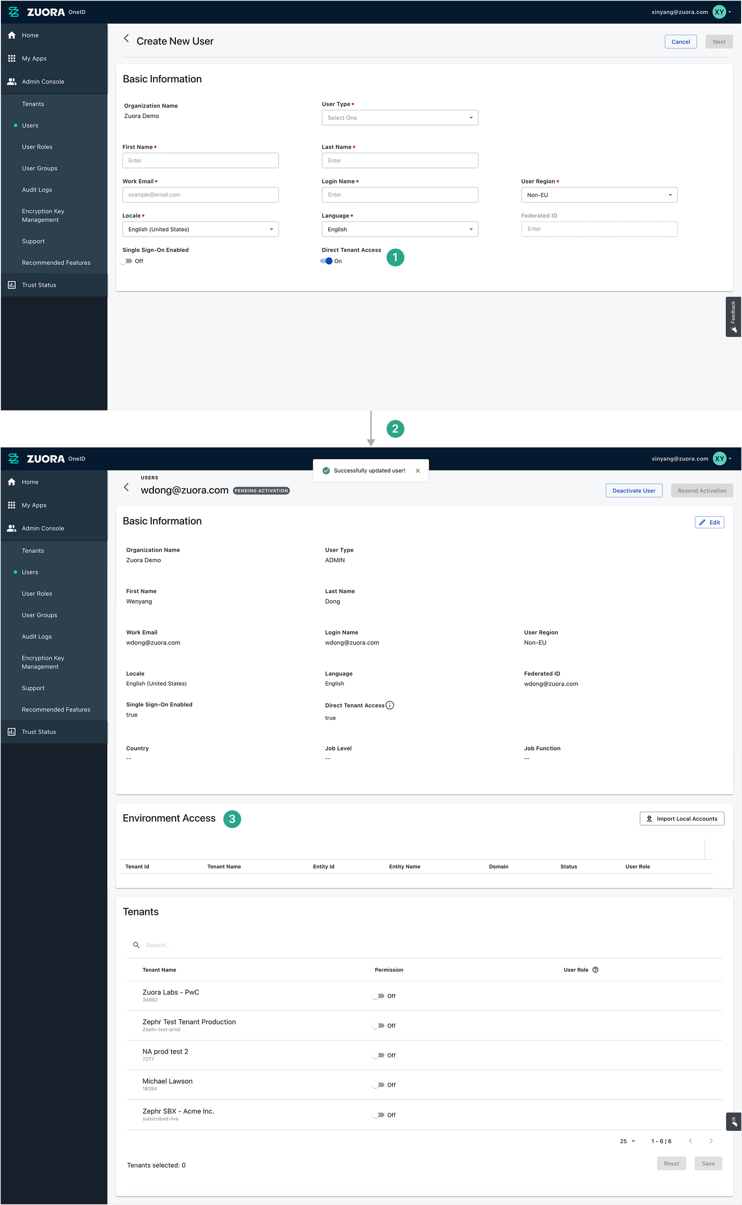
Ambiguity around "Direct Tenant Access"
Users have submitted tickets seeking clarification on "Direct Tenant Access," suggesting the concept is unclear.
Moreover, toggling it on or off provides no feedback, leaving its impact uncertain. In fact, when turned off, the user will be managed through group provisioning mode, which users might not even realize.
Issue 2
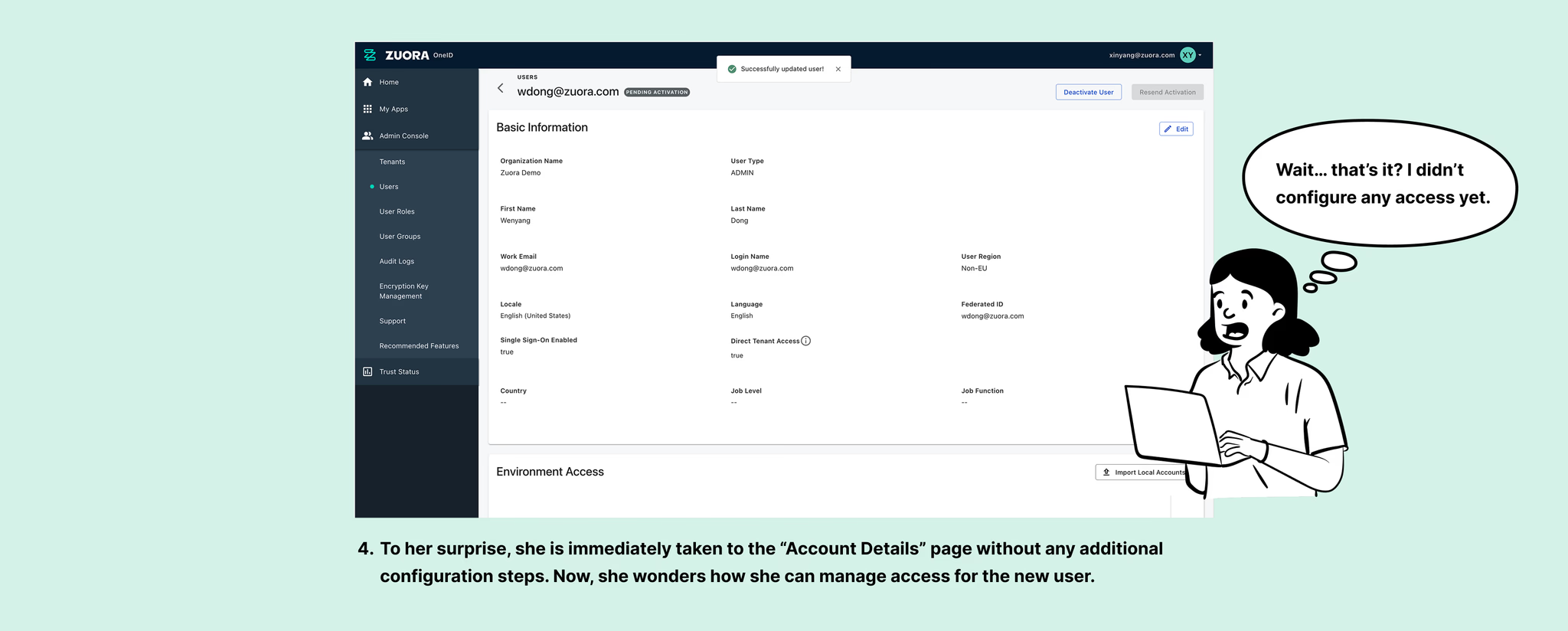
Disconnected flow between profile creation and access management
After entering basic user information, the page redirects to the user details page without guidance on managing access.
The admin is left to figure out on their own that they must scroll down to ‘Tenants' section to assign permissions.
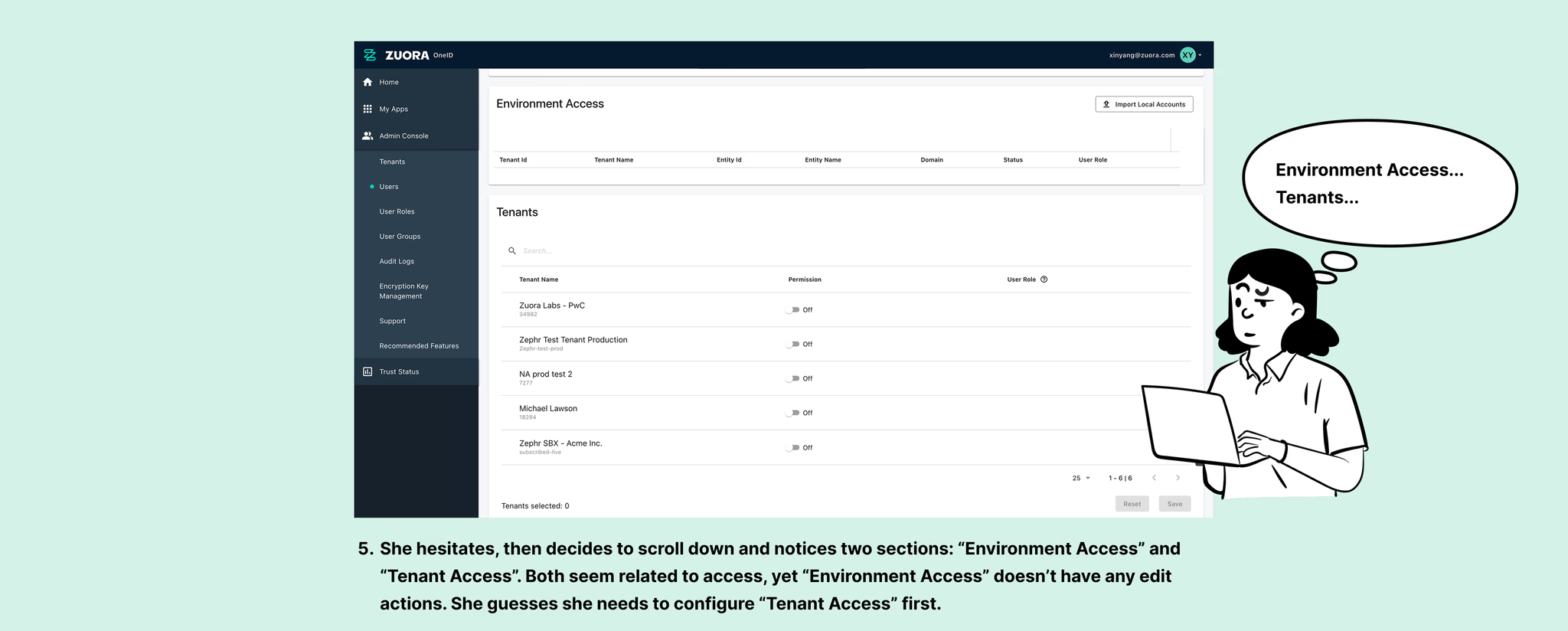
Issue 3
Hidden dependency between "Environment Access" and "Tenants"
Users may not realize that “Environment Access” is actually determined by “Tenant Access”, as both sections are displayed at the same level.
Tackle issues
Clarify provisioning modes and the impact
Instead of relying on the state change of a toggle, displaying the two options directly—Direct Tenant Access and Group Provisioning—would be more straightforward. Additionally, providing clear explanations for both provisioning modes will help users better understand their functions.
In terms of the design options, I chose radio buttons, based on the assumption that users will familiarize with the provisioning modes after initial use. There's no need for repeated explanations, and the selection card takes up valuable space.

When a certain provisioning mode is selected, the system will dynamically show “Tenants” or “User groups” based on that selection, helping users quickly understand how their selection impacts access management.

Integrate access management into user creation flow
To ensure a seamless user provisioning experience, I integrated access management into user creation flow. The two options I considered were:
Using a stepper, with access management as an optional step
Adding an access management card with an option to skip
Both options are nearly identical in terms of user effort. I chose Option 2 because it is more straightforward—users can quickly choose between 'provision via UI' or 'skip' without much thought. Option 1, on the other hand, introduces unnecessary information for users who need to provision via API. Additionally, since user creation is not a complex process, the stepper offers minimal advantages.


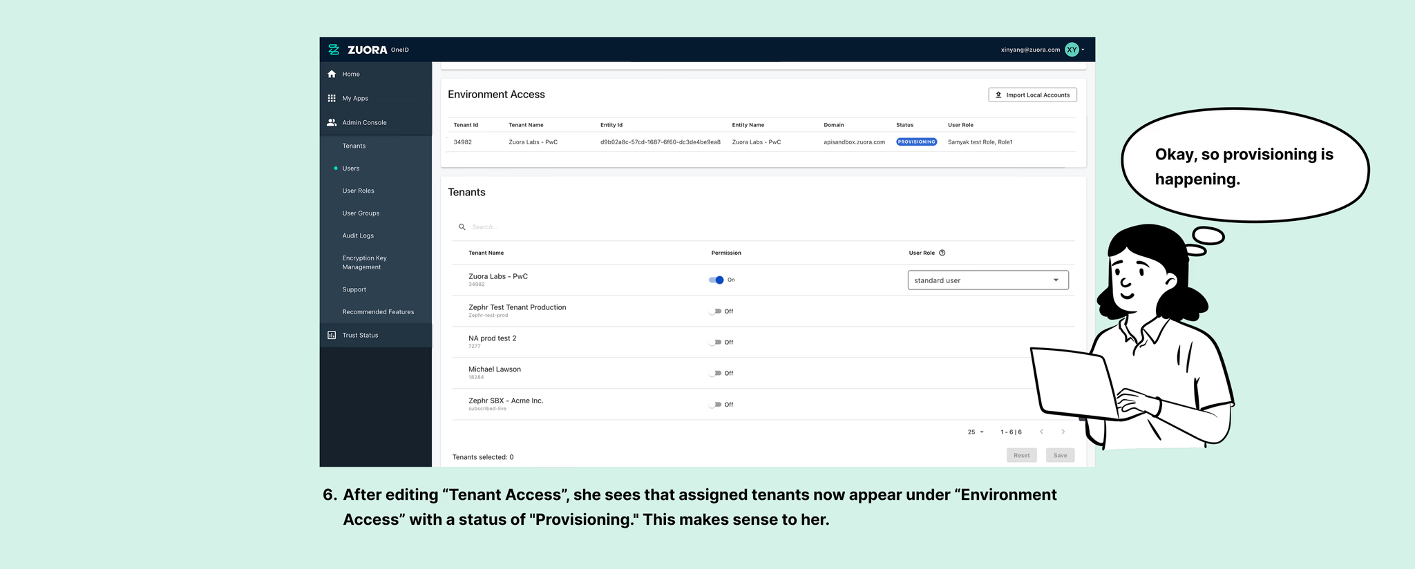
Consolidate "Environment Access" and "Tenants"
Since "Environment Access" is determined by the tenants and user roles assigned in "Tenants" (or "User Groups" in group provisioning mode), and these sections contain overlapping information, I consolidated them into one. Users manage access through the “Tenants” (or “User Groups”) section in a modal, while 'Environment Access' displays the resulting permissions in view mode.

Solution
Revamp into a clear, seamless experience


Update access with confidence


Measure success
While usability testing is an effective way to measure improvements, reaching real admin users proved is challenging. I intended to track support tickets to determine if users were still facing issues to see whether the experience had improved. However, with no new customers onboarded at the time, there was no data available to assess the impact.
While usability testing is an effective way to measure improvements, reaching real admin users is challenging. I intended to track support tickets to determine if users were still facing issues to see whether the experience had improved. However, with no new customers onboarded at the time, there was no data available to assess the impact.